
More instructors are voicing a desire to provide mobile learning experiences for their students. Which we understand, since digital natives already spend 20% of their time on their phones, during class alone. As more people experiment with completing work from their tablet devices or smartphones, we fully support these instructors who want to meet students where they’re most comfortable.
In order to help you effortlessly create amazing learning experiences, we’ve released several platform updates:
- Lesson Themes with mobile-responsiveness, and
- a refreshed look and setup for Lesson Preview.
New Lesson Themes that are Mobile-Ready
We believe that part of engaging your learners in online learning is providing a lesson that lives up to the standards of today’s media; when we learn, we should be able to expect the same high-definition quality that we get from amazing websites, movies, and video games. As such, we’ve always encouraged the use of custom CSS to create more visually-appealing lessons. But we realize that not everyone has the time, resources, or skills to develop custom code.
To make lesson creation faster, we added Lesson Themes to the Author to help you deploy lessons with professional-grade designs with minimal effort – one click polishes your lesson instantly. The themes each use a simple color palette to highlight different elements, making the lesson’s style more consistent and aesthetically pleasing by default.
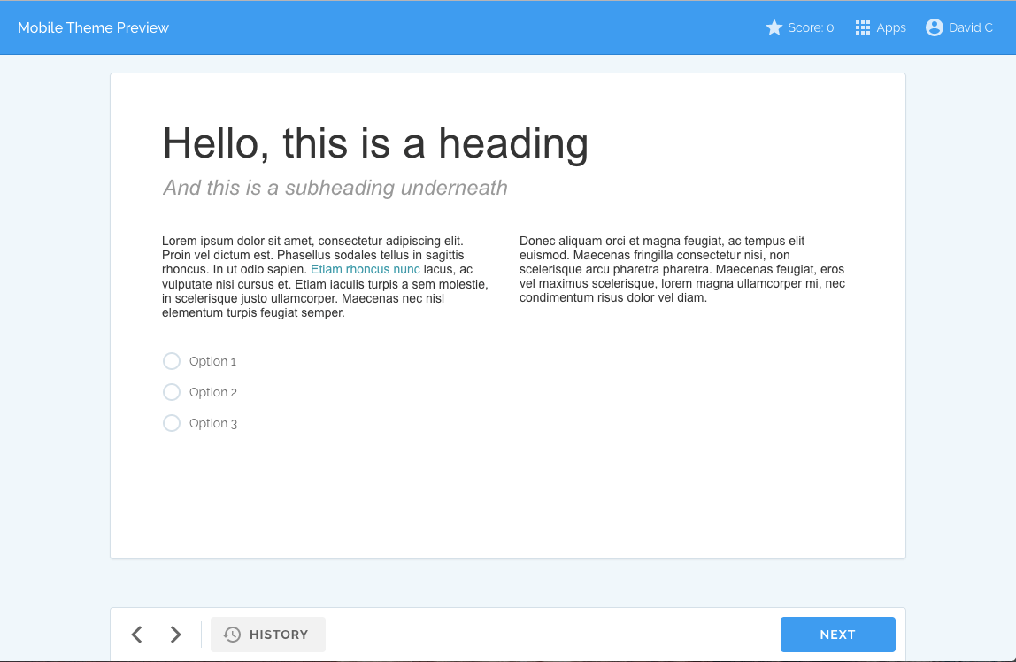
To find the new Lesson Themes, go to the Lesson tab in the Author and click Lesson Appearance. Then, select your theme of choice from the dropdown menu. There are currently four palette options, each with its own mobile-responsive version: Light, Dark, Blue, and Material.
The mobile-responsive version of each Theme will automatically adjust your Lesson layout to better fit smaller screens, such as smartphones and tablets, so your students can access your Lesson from any device and expect a great experience.
Our Lesson Themes and Mobile-Ready versions are in Beta, so we are eager to hear your feedback.
A Note on Applying Themes to Older Lessons
Worth noting is that Lessons created before today’s release will not automatically enable the use of a Theme, so as to maintain the design integrity of deployed Lessons. If you go to their Lesson Appearance settings, you will see the box checked for “Use legacy viewer theme”. If you’d like to retrofit your Lesson for use of a Lesson Theme, you can uncheck this box, select your preferred theme, and Preview your Lesson to make sure it doesn’t conflict with any custom CSS design.
One Preview Panel for Faster Review
Authors and Collaborators have always been able to use the Preview mode to test the design and adaptivity of a Lesson from a student’s point of view. Now, to make the review process easier, we have condensed the Screen List, Adaptivity Review, and CAPI Inspector into a single, more intuitive, panel on the left-hand side of Preview mode.
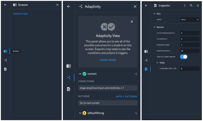
In addition, we improved adaptivity testing to give you more insight into exactly what is happening when the Lesson adapts to students. For every Screen, you can examine the associated Trap States — which are the rules that determine which Adaptive Feedback and Pathways students will encounter as they learn. Then, to test a Trap State and ensure it works as you expect, you can click the Apply Actions button.
Start Creating Mobile-Responsive Online Lessons
If you want to learn more about creating adaptive e-learning experiences, visit our Help Center for more information on creating, deploying, and analyzing lessons. You can also contact our award-winning Learning Design Studio for assistance with design or development on the Smart Sparrow Platform.
We also just released the Answers Report to give instructors deeper insight into student responses and learning. Read more about it here.